

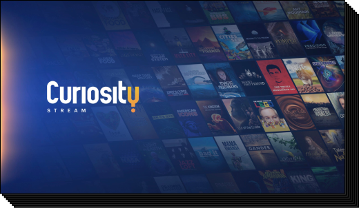
Company: Curiosity Stream, Inc.
Duration: Sep 2020 – Ongoing
Role: Principal Designer
Team: Entire UX Team and Front-End Developer
SUMMARY
In 2020, Curiosity Stream underwent a comprehensive rebranding initiative. Seizing the opportunity from the rebrand. I spearheaded the development of a robust design system. This transformative system emerged as a vital internal tool for both the UX and engineering teams. It streamlined the design process by unifying the color palette, typography, and iconography across web, mobile, and TV platforms. The result was a marked improvement in the product development process, fostering consistency and elevating UX, UI, and overall product delivery. The design system, meticulously crafted in Figma, offered a comprehensive library of readily usable styles and components, enhancing efficiency and collaborative potential within the team.
BACKGROUND
Before then, Curiosity Stream only had a basic brand guideline for marketing. For the UX team, designing often meant copying elements from past design files just to get started.
OBJECTIVE
it was crucial for the Design System to swiftly adapt to our evolving needs. With new use cases emerging and the library expanding, I strategically prioritized rapid scalability and modularity. This led me to focus on crafting reusable components and templated layouts to ensure the system could efficiently accommodate our evolving needs.
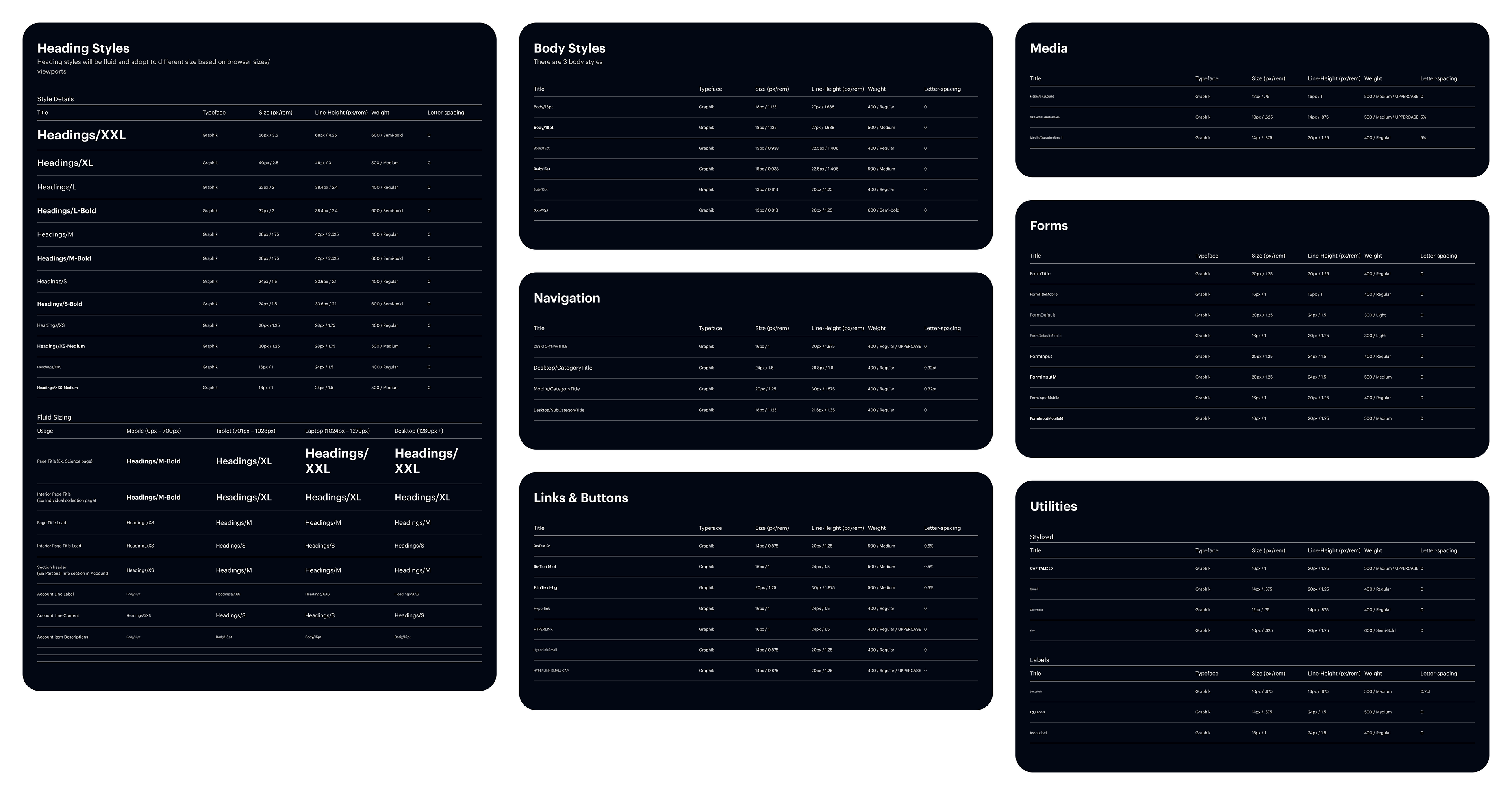
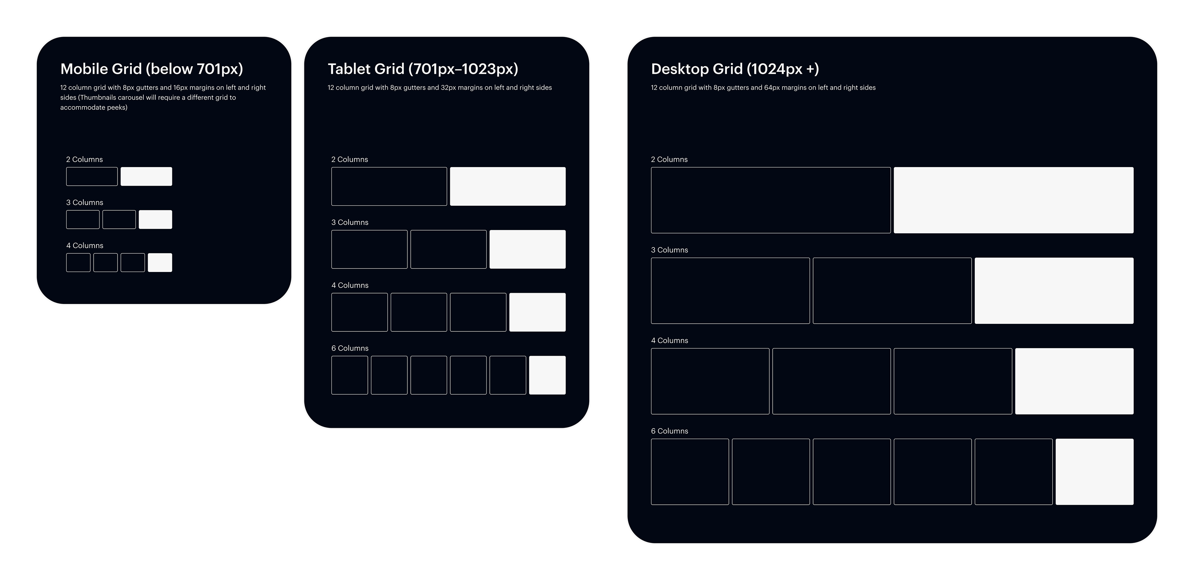
SETTING UP THE SYSTEM FOUNDATIONS
The first step was to establish the typography, colors and grid system. For typography, I mapped out the different styles and their usage. And also worked with the Lead Front-End Developer on their title/css labeling to be used in Tailwind CSS and Storybook.
SYSTEM FOUNDATIONS
Typography
Colors
Grid
Colors
Grid

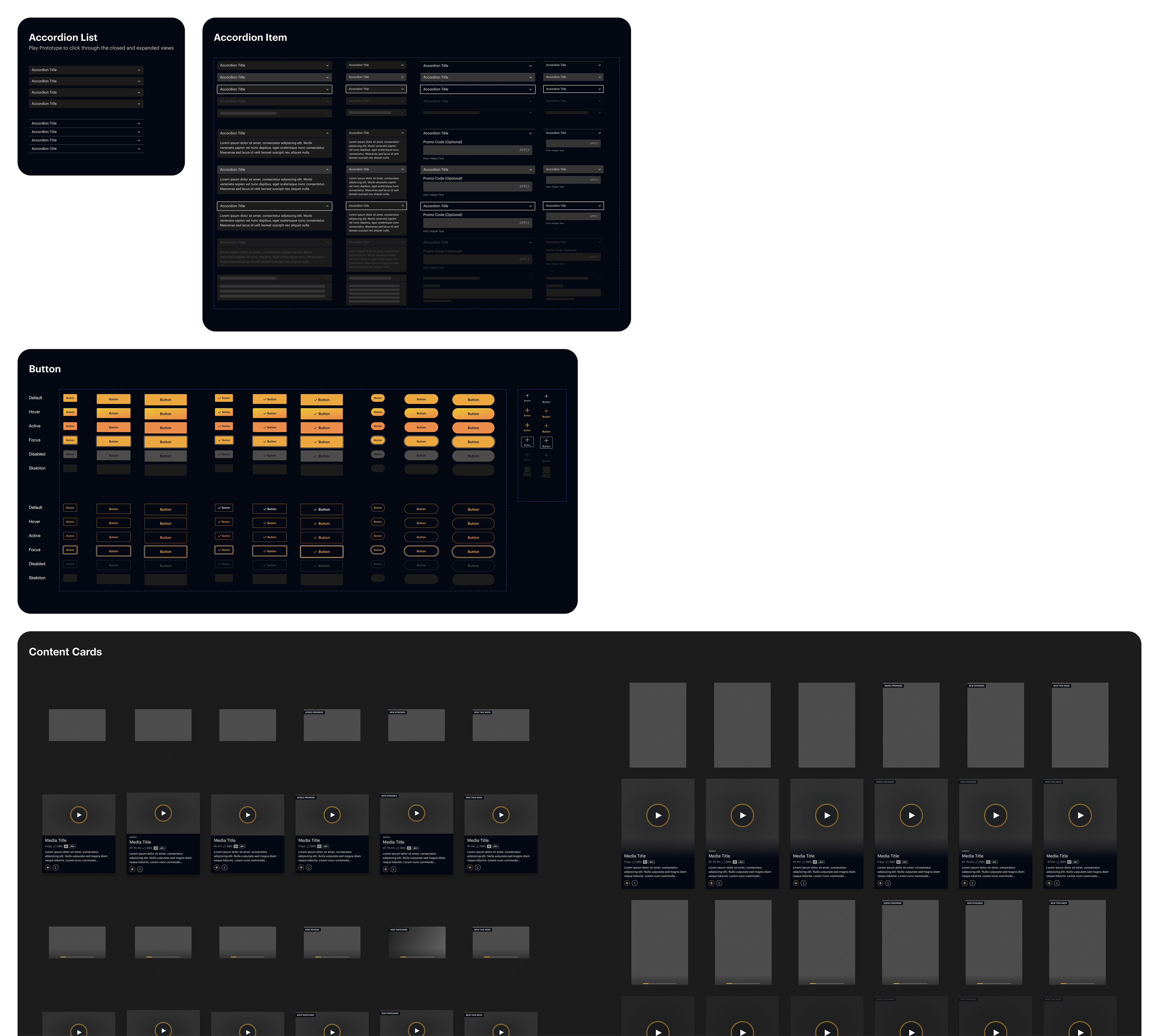
Next, my focus shifted towards building a dynamic collection of components, drawing from the principles of Atomic Design. Working in conjunction with the developer, we meticulously organized and named the components so that both design and development are aligned and worked seamlessly.
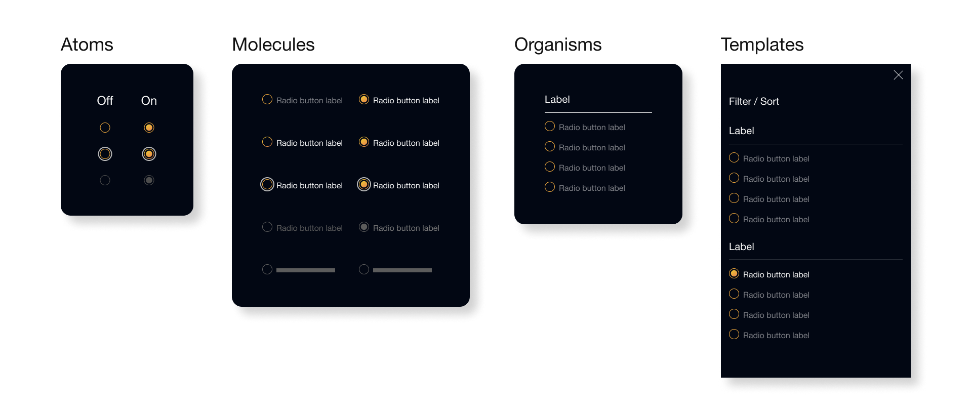
COMPONENT LIBRARY
Variants
All Platforms
All Platforms
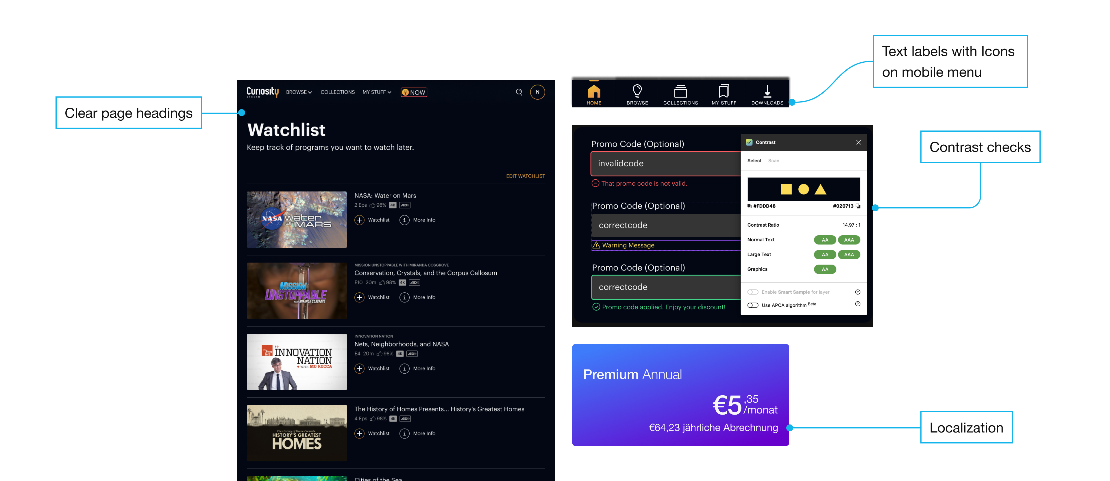
ACCESSIBILITY AND LOCALIZATION
Curiosity Stream has subscribers all over the world and often times used for educational purposes. So accessibility and localization was highly considered. This encompassed several key principles:
— Incorporating text labels alongside icons for mobile navigation.
— Verifying appropriate font sizes and touch targets for mobile devices.
— Evaluating color contrast across various backgrounds and interaction states to meet Web Content Accessibility Guidelines.
— Accommodate diverse languages length
These efforts established a foundation that aligns the design system with accessibility standards, underscoring our collective commitment to inclusivity
RESULTS
After 3 months, I established the base of the Design System, and was setup to move with speed and consistency:
— It provided a cohesive look and feel from the rebrand
— It optimized the design workflow, a critical advantage for a small team or solo designer.
— It equipped the UX team and developers with a unified reference point and a suite of reusable components and patterns, which means quicker turnarounds from design to launch. At times, the developers even independently generated rapid prototypes.
The Design System goes on to grow and evolve as new design projects comes along.